Horsehill Vineyards is a winery based at Cal Poly Pomona that produces wine through the involvement of student learning and participation.
Every year, the winery produces a different vintage of wine. Every part of the production includes student involvement. This ranges from caring for the plants, picking the grapes, selling the wine, and designing the label. Through this process, Horsehill Vineyards aims to produce quality, award winning wine.

-
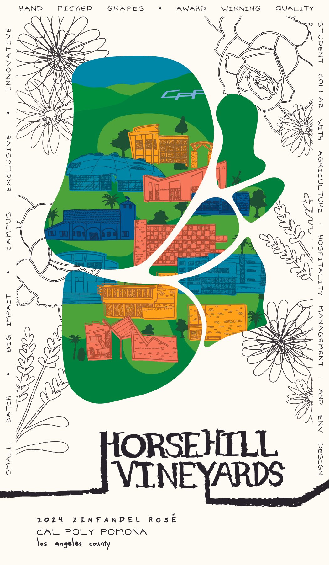
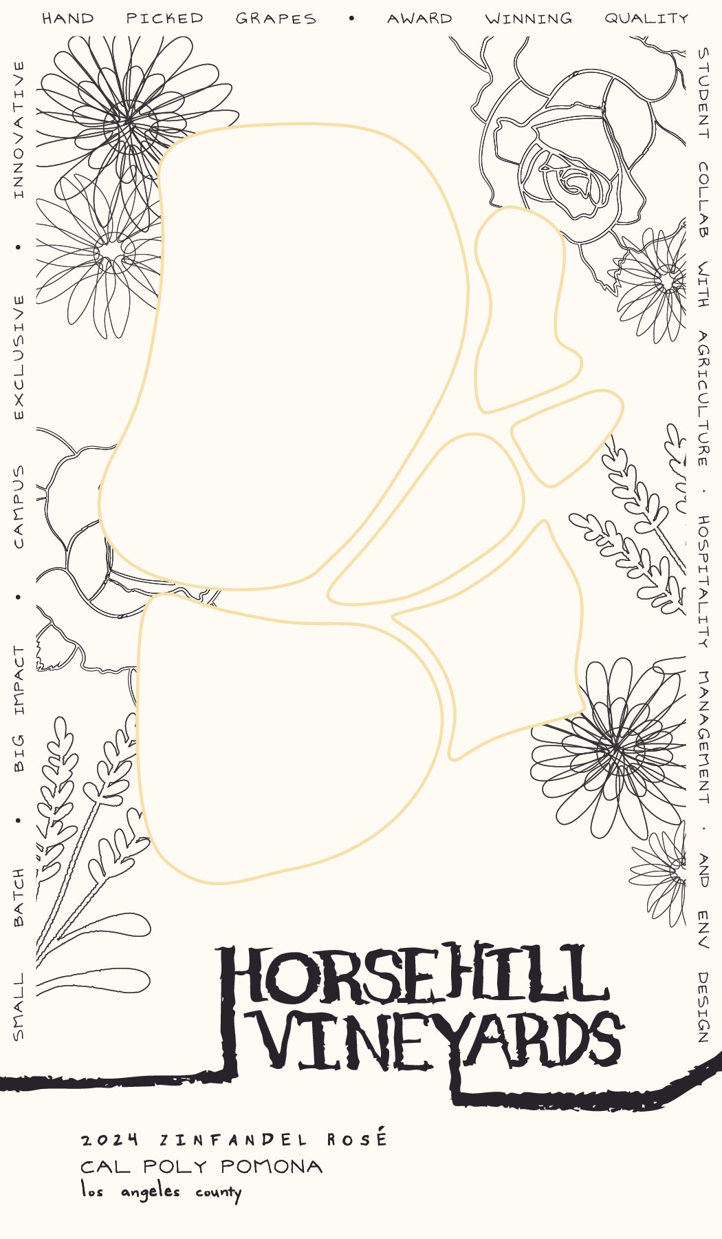
Horsehill Vineyards wanted a brand that incorporated multiple layers. For one, they wanted their brand to be relating back to Cal Poly Pomona. This was a challenge due to the college’s strict rules about referencing alcohol and the campus. They also wanted the brand to emphasize how the process of making the wine was hand done by students.
-
From my team, the ultimate deliverable was a wine label that reflected the values of the winery. This included a front label, a back label, and a possible cork or stelvin design. We also introduced possible opportunities to expand the branding through packaging, tear sheets, and displays for where the wine would be sold.
-
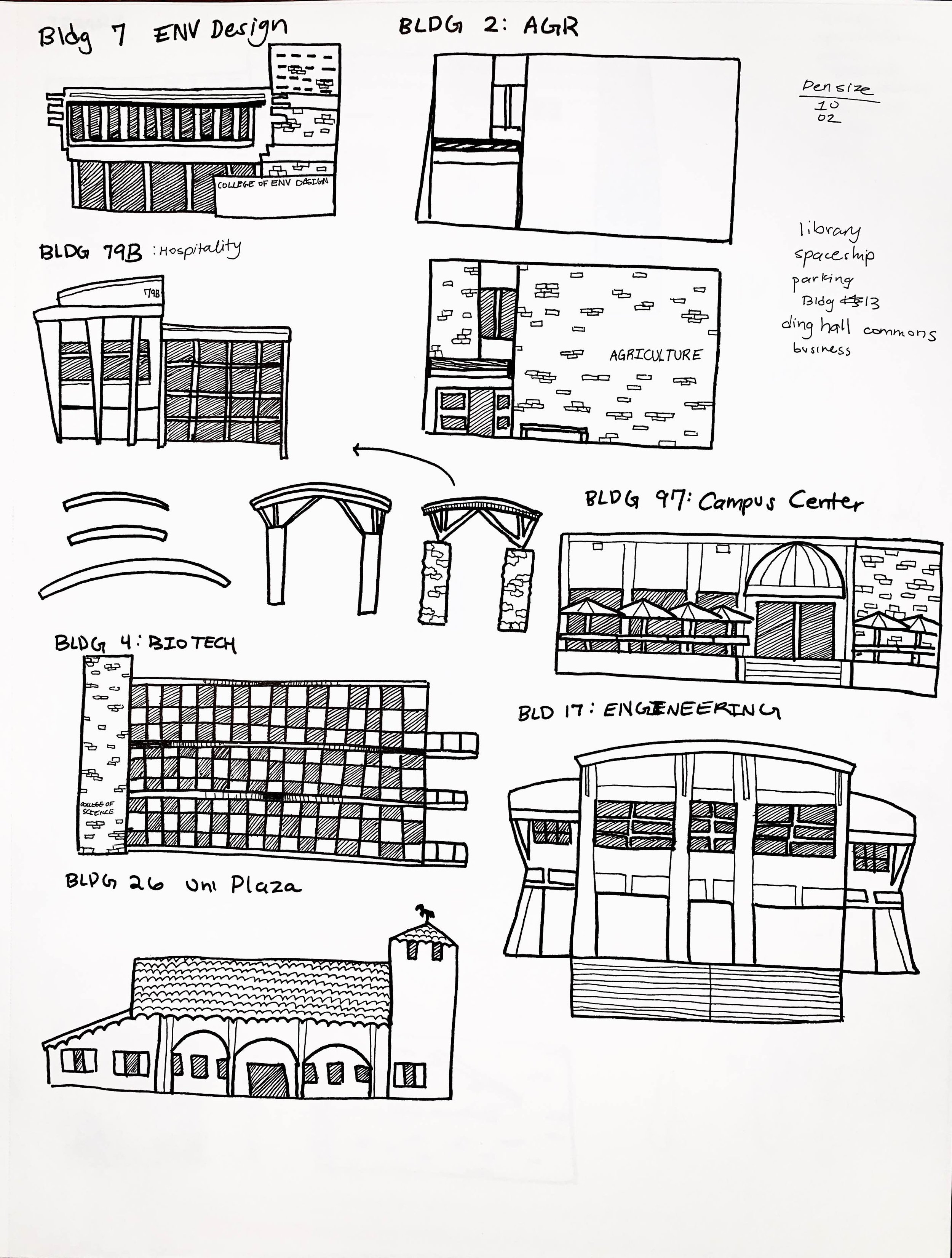
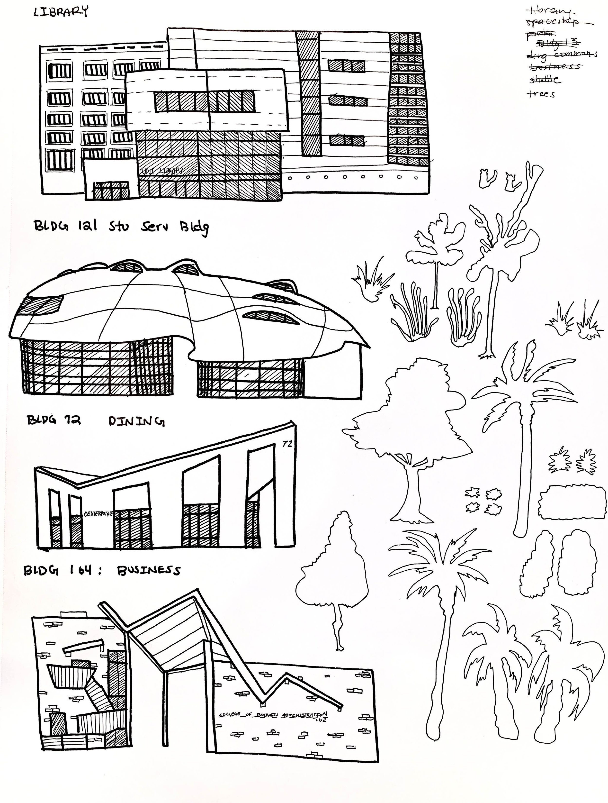
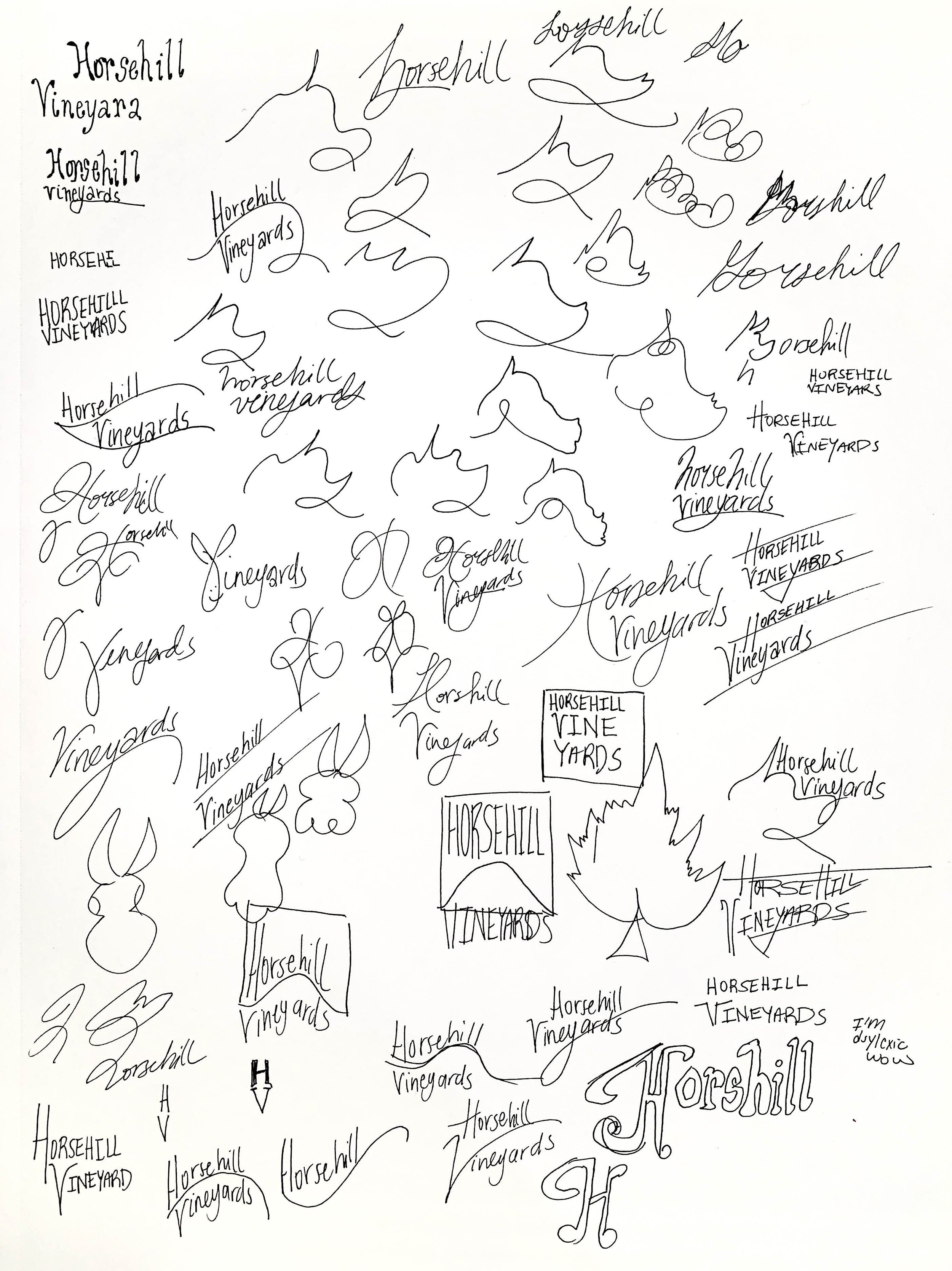
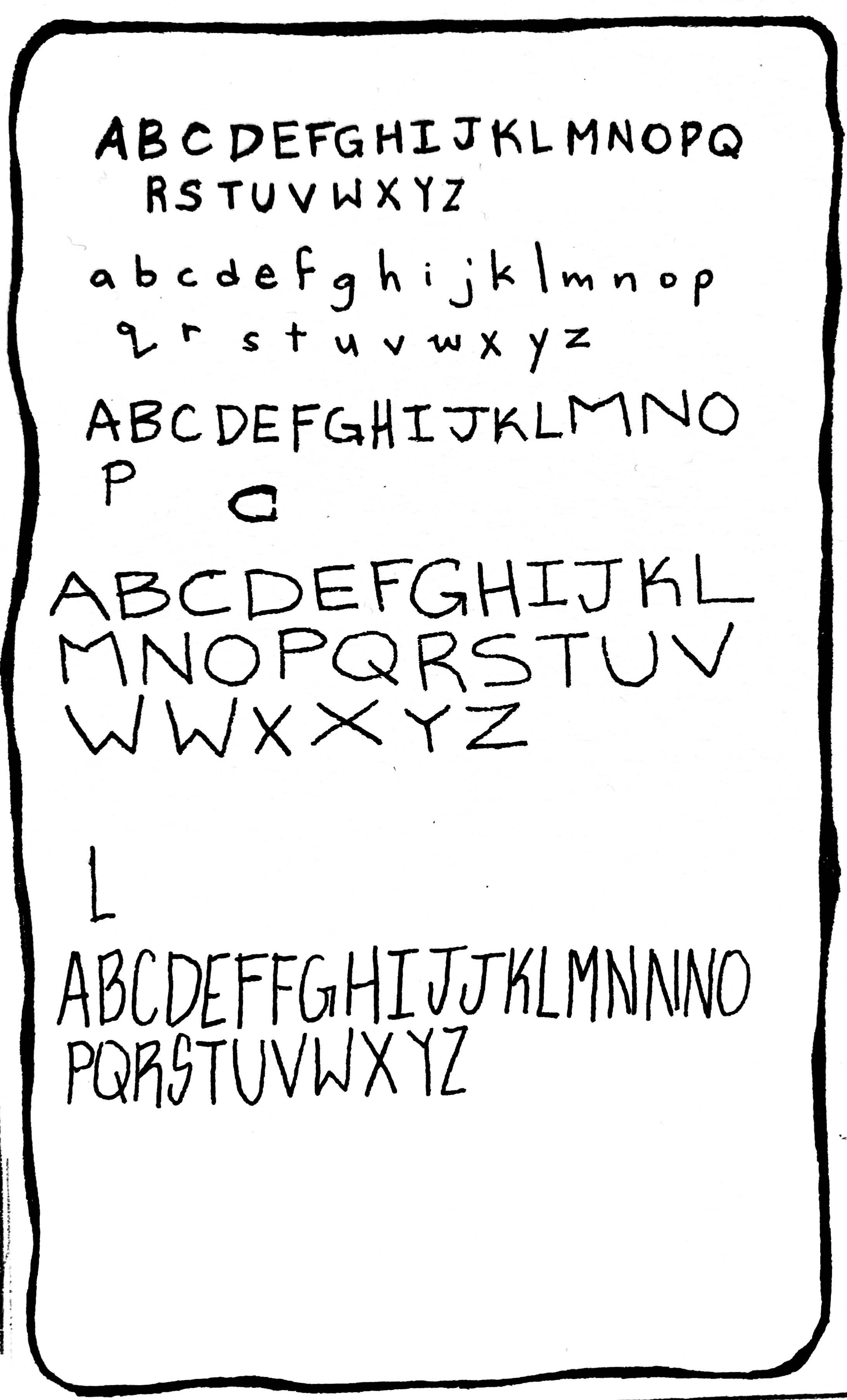
My team decided to approach this project through a die cut and sandwich label. We combined our multiple ideas into literal layers thanks to this approach. Our front and back label feature handmade type to connotate the wine being made by hand. The words bordering the label describe the student experience. The florals on the wine were added to create a feminine touch while also beginning to describe features on the campus. The die cut’s geometry was taken literally from the campus map. Through this die cute, the viewer would then be able to see an illustration of the campus’ main buildings in the school colors. Yellow was specifically reserved to emphasize the colleges that contributed to the wine production process.
-
Amanda Rosario, Ashley Tossounian, Elizabeth Cabrera, Nancy Govea, Nissa Toriz